Friday, December 30, 2011

Sew-Along Project: Sleep Pants (Part 1)


If you've been wanting to learn how to sew, or you know how to make pillows and tote bags but have always been scared of making clothing, I invite you to join my sew-along that I'll be hosting on this blog!  Together, we'll be making some fairly simple projects that will nevertheless help you learn sewing basics and some useful techniques.  So, welcome to our first sew-along project, which is pajama pants, also called sleep pants.

Above is the pattern that I recommend for this project.  It's a McCall's pattern and is suitable for men, teen boys, or women.  You don't have to use this pattern, but you should select one that is similar -- a pant that is loose, with an elastic waist, and only two pattern pieces (front and back).  One of the reasons I chose pj pants for our first project is that while it's an item of clothing, perfect fit isn't super important.  If the pants turn out a little longer or shorter than you thought they'd be, or they are a little baggy, or you make some mistakes in construction as we go along, no big deal.  You can still wear them around the house even if they're not perfect!

I'm going to make my sleep pants for this project out of flannel, and you can pick either flannel or just a plain cotton fabric.  You want all cotton fabric, or mostly cotton, for this project.  When you get the pattern, flip it over and you can find out from the pattern envelope how much fabric to buy for the size you need.  If you have trouble figuring it out, someone at the fabric store will surely be glad to help you.  TIP:  I always buy a little extra fabric, just in case.  You don't have to do this, but I highly recommend it, especially if you've never laid out pattern pieces on fabric before.  I like to get about 1/2 yard extra, if possible.

In addition to the pattern and your fabric, you'll want to get thread (a neutral color like off white is fine for most sewing) and a package of elastic for the waistband of your pants.  The pattern envelope says to get 1/2" elastic, and that's fine, but I prefer to use 1" elastic, simply because it makes the sleep pants look more like ones you'd buy in a store.  Either way, find non-roll elastic if you can.  Other than those things, you'll need to have the basics at home:  pins, scissors for cutting your fabric, a tape measure, and an iron and ironing board.  If you hate to iron, join the club, but the truth is that ironing is absolutely essential to sewing.  You cannot make a nice looking anything without ironing.  The good news is that the ironing is simple.

Okay, you've brought everything home and you're ready to go.  The first thing you are going to need to do is WASH and PRESS your fabric.  I know, I know.  I really hate this part of sewing -- you're all excited about getting started with a project, and you have to do this time consuming and boring part.  But, you really need to do it.  Flannel and other cotton fabrics shrink, sometimes a lot, and the only way to get a garment with measurements that are close to those on the pattern envelope is to make sure your fabric has shrunk as much as it's going to before you lay out the pattern.  So, wash your fabric in warm water, by itself.  TIP:  It can be a pain to fold your fabric back up after washing, so what I often do is, BEFORE WASHING, pin along the fabric edge with safety pins, pinning the two selvages together.  Here is a picture of what I mean:


The selvages of your fabric are the the long edges; usually the fabric manufacturer's name is printed on there, or sometimes they are just plain.  So what you're doing is pinning the two open edges together.  Now wash and dry your fabric, leaving those safety pins in place.  When you take your fabric out of the dryer, it will be kind of a mess, but you need to fold it in half length-wise, the same way it was when it was on the bolt at the store.  If you've pinned the selvage edges together, this shouldn't be hard.  Now, press your fabric, using the cotton setting on your iron.  You want the wrinkles out, and you want a nice smooth surface to lay your pattern on.  Put your fabric over the ironing board like this:


Then, press the fabric in small sections, from the selvages to the fold.  You can press right over those safety pins as long as you're careful and don't move the iron around when the pin is under the iron.  Press the entire length of your fabric until the whole thing is nice and smooth.

Next, find your two pattern pieces and cut them out.  If you're using my recommended pattern, the pieces are number 11 and number 12.  THE PATTERN WILL HAVE SEVERAL CUTTING LINES ON THE SAME PATTERN PIECE, FOR THE DIFFERENT SIZES.  MAKE SURE YOU CUT ON THE CORRECT LINE FOR THE SIZE THAT YOU NEED.

Lay your fabric out on your cutting area with the FOLD of the fabric facing you, like this:


You can definitely damage a table cutting fabric on it, so you want to use an old table or a surface that won't easily scratch.  Check the instruction sheet in the pattern envelope for a "layout" of how to place your pattern pieces on your fabric so that they fit.  I don't always follow the suggested layout exactly, and that's why I get that extra bit of yardage, so I don't have to worry about having enough.  Lay your first pattern piece down as indicated on the layout, and look for a long arrow that says "grainline."  In order to follow the "grain" of your fabric, this line has to be parallel to the edge of your fabric.  The ONLY way to make sure that the grainline arrow is exactly parallel to the edge of the fabric is to MEASURE.  Measure from one end of the grainline to the fold, as I'm doing in this photo:


Place a pin right at that end of the grainline arrow.  Now, go down to the OTHER end of the grainline arrow, and measure again from the line to the fold of your fabric.  The measurement here must be the same as the measurement at the other end; if it's not, adjust your pattern piece on your fabric until you get the same measurement at the other end of the grainline arrow as you did at the first end.  Here, I've got 9" at the second end, the same measurement I had at the first end.


Again, put a pin right on the line, just like you did before.  The next two photos show my pins at both ends of the grainline.


I know it seems like I'm spending a lot of time talking about this one tiny thing, but getting the grain straight is REALLY IMPORTANT.  Every pattern piece of any garment you make will have a grain line, and you always need to make sure that line is parallel to the edge of your fabric.  So get in the habit of measuring and pinning, and your projects will come out right!  Oh, I should mention about that holly-patterned tissue paper in the photo above.  My son, for whom I'm making these pj pants, is 6'2".  I had to lengthen the pattern in order for the pants to be long enough for him.  There is a line on the pattern that says "shorten or lengthen here," and I just cut at that line and inserted a piece of tissue paper, lengthening the pattern by about 4 inches. Anyway, you'll see that crazy tissue paper in the next few pictures, so I thought I should explain why my pattern looks like that!

Ok, after the grainline is pinned, smooth out your pattern piece and pin all along the edges.  Place a pin every few inches.  It's faster to use fewer pins, but frankly, cutting goes a lot easier with more pins.  After you have piece number 11 all laid out and pinned down, repeat the same process with piece number 12.  Again, be sure to measure and pin at both ends of the grainline.


After you have both pieces laid out on your fabric and completely pinned down, cut around the pattern pieces.  Take your time and make sure you are following the cutting line EXACTLY.  Remember that you can turn your fabric around to make it easier to cut areas like curves, etc.  DO NOT UNPIN the pattern from the fabric!  When you're done cutting, you'll have two pieces that look like this:


If you look along the curved edges of your pieces, you'll see a little "circle" on each pattern piece that the instructions will tell you to mark.  You want to mark it so that you can identify that spot on the fabric when you are sewing along.  I like to mark with a tracing wheel and dressmaker's tracing paper, shown below:


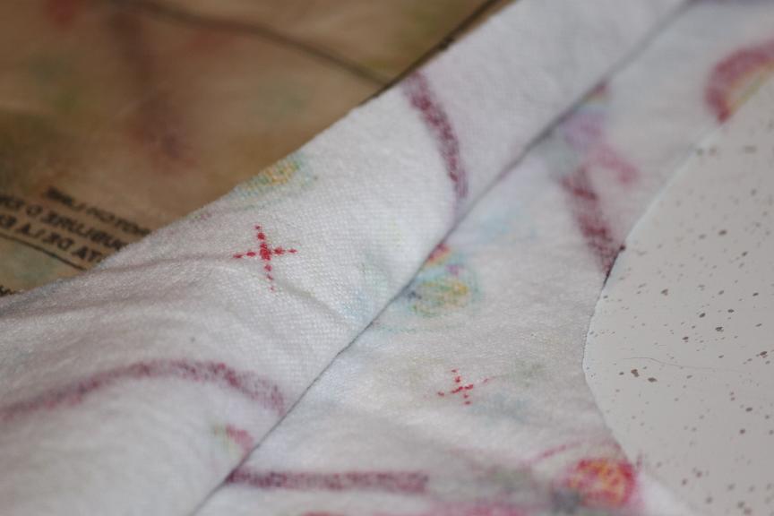
If you don't have these things, don't worry.  You only have two little circles to mark on this pattern, so you could just use a pencil if you wanted and make a light mark.  You can also mark with something like dressmaker's chalk, which brushes off.  The important thing is that you want to mark those dots on the INSIDE of the fabric, so you can see the marks when you're sewing.  If you're using the tracing paper, you insert it between your fabric layers (assuming the printed side of your fabric is on the outside) and then just mark an "x" at the circle, using the tracing wheel.


Here is what that "x" looks like after it's marked onto the fabric.  I used red tracing paper so the "x" would show up really well.  This stuff really doesn't wash out,but most of the mark will get sewn up into the seam and won't be visible.  You do NOT need to mark the fold line for the waistband casing (this is indicated on the pattern).  We'll just measure to get our waistband fold, when the time comes.


Now, before you unpin your pattern from the fabric, there is one more thing you have to do.  You need to find all of the "notches" on the pattern and make a little snip with your scissors at each notch.  There will be some single notches, and some double ones.  For double ones, make two snips, one at each notch.  This is what a snipped double notch looks like:


 Be really careful NOT TO SNIP BEYOND THE POINT OF THE NOTCH.  If you do, you might end up with a hole in your seam where you snipped.  Just make TINY snips, right in the center of each notch.  Once that's done (there are only a few notches on each piece), you can unpin the tissue patterns from your fabric.  Fold up the pattern pieces because this is the kind of pattern that you can use again and again -- pj pants are a basic, right?  Now, one final TIP:  I suggest that you put a pin along the waistband edge of each of the two pieces of fabric for the FRONT of the pants.  Make sure the pins are secure, like this:


You don't HAVE to do this, but here's the thing.  The front and back pieces of a pair of pants look remarkably similar.  It just helps the sewing go more smoothly and quickly when you know which piece is the front and which piece is the back.

Okay, that's it for Part One!  To sum it up, for Part One, you bought your pattern, fabric and notions, then you washed, dried and ironed your fabric.  You laid out your pattern pieces and cut out the fabric, then you marked the circles on the inner leg seam.  Next time, we're going to work on seams, and I'll show you how to make a flat-felled seam.  (If anyone is has any questions about Part One, I will be starting a thread on the Two Peas NSBR board.  I thought this would be a better venue for back and forth chat rather than trying to do it through the blog comments.)

I'm going to give everyone a couple of days to get this first step completed, and then we'll move on to Part Two!  See you soon!

Saturday, December 17, 2011

Great Gift: Hot Spiced Tea Mix


At my office, there are about 21 of us in our division, and we work fairly closely together.  So, when the holidays come around, I like to make a little something that I can "gift" to everyone in the division.  Because the people in my division are both genders, range in age from early twenties to 50+, and run the gamut from sophisticated foodies to non-cooks, food gifts can sometimes be tricky.  But, pictured above is a wonderful treat that is very low-cost to mass produce, and it's something that everyone seems to appreciate and enjoy.

I've been making this Hot Spiced Tea Mix since 1999.  I know that because I had to develop my own recipe after not finding one that suited my tastes, so when I typed it up on the computer, I noted the date of "creation."  The funny thing is that, since 1999, I've had to change the recipe a bit.  When I first made this tea mix, it was easy to find unsweetened powdered iced tea mix with lemon -- most grocery stores carried several brands of it.  Now, plain iced tea powder is about all you can find.  I suppose the popularity these days of teas in general, plus the prevalence of "gourmet" teas and coffee, has led to the demise of various types of iced tea mix.  So my recipe now uses just the plain tea powder, which should be readily available in most grocery stores.  Remember to get the UNSWEETENED type, as you'll be adding sugar according to the recipe.

Barb's Hot Spiced Tea Mix

2 (4-oz.) jars unsweetened iced tea powder
21 oz. container Tang (powder to make 6 quarts)
3 cups white sugar
1 T. ground cinnamon
1 T. ground allspice
1 tsp. ground cloves
2 envelopes unsweetened lemonade flavor Kool-Aid

Combine all ingredients in a large bowl.  Spoon mixture into half-pint canning jars for gift-giving.  Recipe makes enough to fill about 12 half-pint jars.  Include the following directions with each jar:  To use mix, place 2-3 heaping teaspoons of tea mix in a cup or mug; fill with boiling water and stir well.

That's it!  That's all there is to it.  Super simple and super quick.  For the jars in the photo above, I made some simple gift tags with snowflake stamps and blue and purple inks, then printed the tags (with directions) on the computer.  I added a bit of ribbon and a brad to the corner of the tag to pretty up the jars, and adhered them to the jars with double stick tape.  They look adorable, don't you think?

One more note.  If you encounter a few "I don't drink tea" type comments when you hand out the jars, encourage people to just give the mix a try.  Because it's got a lot of sugar and spice and citrus flavors in it, it's not much like a plain cup of tea at all.  Even kids will love this tasty hot beverage (and the mix can be made with decaf iced tea powder if you'd prefer).

Happy gifting!!!

Sunday, November 13, 2011

BBQ Beef Cups


I am always looking for quick and easy dinners to make on busy weeknights -- aren't we all?  I found this recipe a few months ago, and it was such a winner with my family that I thought it was worth sharing.  It totally fits the "quick and easy" bill so makes a perfect meal for one of those nights when your kids have sports or other activities that you need to hustle to.  It probably isn't the most healthy recipe you'll find, but if you wanted, you could make it lower-fat by using ground turkey instead of ground beef, and using reduced-fat biscuits.

BBQ Beef Cups

1 lb. ground beef
1 small onion, minced
1/2 cup barbeque sauce
1/2 cup shredded Cheddar cheese
1 tube (12 oz.) refrigerated biscuits

Preheat oven to 375 degrees.  Grease the cups of a muffin tip.  Separate the can of biscuits and, with your fingers, press each piece of biscuit dough into a flat circle.  [Tip:  Look for biscuits that have 10-12 biscuits in a 12 oz. can.  Do NOT use Grands biscuits, or ones that are similarly big.]  Carefully fit each circle of dough into one of the muffin cups; it's important that the circle is large enough so that the dough comes to the very top of the muffin cup.  Meanwhile, brown the ground beef and onion in a skillet over medium high heat until beef is no longer pink and onion is tender.  Drain off grease.  Stir in the barbeque sauce.  Now, fill each of the dough cups in the muffin tin with some of the meat mixture.  Top each cup with a little bit of the shredded cheese. 

Here's a picture of how the cups will look just before you slide them into the oven:


Now bake the cups in the preheated oven for about 15 minutes, until the biscuits are browned and look done.  Carefully remove cups from muffin tin to serve.  Here's how they'll look after you take them out of the oven:


Don't they look yummy?  And I promise, your kids will gobble them up!  Oh, and just in case you're worried about it, you shouldn't have any problems getting the finished beef cups out of the muffin tin.  Biscuit dough contains some fat, and if you've also greased the muffin tin cups ahead of time, the finished goodies should pop right out.  Add a vegetable and a glass of milk, and dinner is served!

Saturday, July 9, 2011

Everyday Cards


Every time I go to a crafts store lately, I find myself absolutely drooling over the new K&Co. collections that they have out.  And, it seems like there are almost always a couple of new collections, or ones that I haven't seen before, pretty much every time I drop into Michael's or JoAnn's.  I try really hard not to buy it all, in part because a lot of K&Co. stuff, while I love it, is very feminine and flowery and as far as scrapbooking, I just don't use those kinds of papers and embellishments.  I do the occasional feminine page, but with two boys, I use a lot more neutral or outdoorsy kinds of things.  But, I do make girly cards, and I just could not resist buying some stuff from one of the most recent lines, called Aubrianna.  The colors are blues, purples, pinks and greens, and the papers and embellishments are all so beautiful that I just could not resist buying a few items and making some cards.  Here are a few of the cards, up close:


Above is a close up of some of the embellishments on the card made with little squares of paper.  One thing I love about K&Co. is that they make their paper pads in that little 5x7 size, so you can use the sheets as photo mats or for card backgrounds.  I wasn't willing to toss any of those beautiful prints away, which is how I ended up making a card with the little scrap squares.

The one below is probably my favorite of the bunch.  I just love how the polka dot flowers (those are Prima, I think) look with the chipboard embellishments in the center.


Here's a close up of those flowers:


And here are a couple more cards, using really pretty blues and greens:


You know, I really need to find more people to write and send cards to on a regular basis.  Cuz I've already got more cards in my stash than I could ever use, and still I make more!  Oh, well.  What can I say?  Sometimes that K&Co. siren is just calling my name.

Sunday, June 26, 2011

Nestabilities Nametags


Well, it appears that I have been MIA for awhile.  We had a crazy busy spring and end of the school year.  If you have kids in high school, especially, then you know what I mean.  So many events, awards presentations, dinners, and so forth, all packed into those last few weeks of school.  That push is over so I'm going to try to get back to regular blogging.

One thing that kept me busy this spring was helping a good friend with a wedding shower she was throwing for her future daughter-in-law.  She is a very picky, detail-oriented person (gee, where have I heard that description before?), and she spent months planning this shower and was so anxious for every single thing to be perfect.  The idea for the shower was wonderful -- we all met at a local quilt shop, and we spent the afternoon making a quilt top for the bride-to-be.  My friend and the bride-to-be had previously come in and picked out all the fabrics for the quilt, as well as the design for the blocks.  On the day of the shower, a woman that teaches classes at the quilt shop taught us all how to cut, press, etc.  I was one of the sewers, which was a lot of fun.

Anyway, a few weeks before the shower, my friend mentioned to me that she was thinking of having nametags at the shower.  The reason was that a lot of the bride's family was coming, but also a lot of the groom's family, and no one had really met each other before this occasion.  She thought it might make everyone feel more comfortable if they had nametags.  I had just (the week before, in fact) bought my very first Nestabilities dies at a scrapbook convention that I went to.  One of the sets I bought was Fancy Tags 2, and I started thinking that those tag shapes might make beautiful nametags.  So, I made a couple of mock-ups for my friend to look at, and then, armed with a list of all the invitees, I set about making the nametags.

My friend did not want the nametags to have pin backs, because she didn't want anyone to ruin a nice blouse or dress, so we decided to use double stick tape on the backs.  I cut the nametags out of heavy cardstock in the shower colors (pink and pale green), and then embossed them.  I then formatted all of the guests' names in my word processing program using a pretty, frilly font, and I printed the names onto the die-cut nametags.  Then I spent a bit of time dressing up the nametags a little bit with glittered flowers and gemstones.  I made a few extra tags without names, just in case someone unexpected showed up, or someone ripped or ruined their original nametag.  We put the nametags out on a table right by where all of the guests entered the room.

The nametags looked really cute, and making 20 or so of them cost only a few dollars and a little bit of time.  It's funny, when I bought that set of Nestabilities dies, I really didn't have any idea what I was going to do with those tag shapes.  I just knew that I was crazy about them!  I'm sure I'll end up using them for lots of cards and other paper crafting projects, but I'm pleased that the first thing I did with that die set was make some gussied-up nametags for a wedding shower!
 

Saturday, April 30, 2011

Painting on Glass


Last month, at my office, we had a Pi Day celebration.  You know, pi, the endless irrational number?  Apparently geeky types celebrate Pi Day every year, but even though I had not heard of it before, I found myself in charge of organizing our office Pi Day festivities.  Oh, in case you're wondering, Pi Day is March 14.  Get it?  The first numbers of pi are 3.14, so Pi Day is 3/14 or March 14.  Ok, back to business.

We had three different contests as part of our celebration, and my boss generously provided a gift certificate to a local restaurant as a prize for the winner of each contest.  That was great, but I also wanted the winners to have a little something to actually commemorate the fact that it was Pi Day.  So, the idea of awarding "pi plates" was born.  I know, I know, super clever play on words, right?  Well, I wanted something that could easily be "marked" with the pi symbol, so glass came to mind, and then the "pi plate" idea was hatched from there.

Because the finished plates came out so well, I decided to feature the idea here on my blog.  Obviously, the idea and technique are adaptable to just about any flat or curved glass item, and you can paint any letter, graphic image or artwork that you want to.  A pie plate or casserole dish with flowers or hearts painted on the bottom would make a cute wedding shower gift, or you could paint the bride's new initials.  If you have ever taken a "generic" casserole dish to a big pot-luck get-together, you know that it isn't always easy to be sure that you get your dish back afterward.  Well, a dish with your initials on it, or with some unique graphic image on it, is sure to be returned!


For the "pi plates," all I did was find an image of the pi symbol online that I liked.  I copied it to my computer and then sized it using a photo-editing tool.  I had to experiment a bit to find the size that would work for the glass dishes that I was using, because I wanted the image to be very prominent and large.  Now, here is an important tip -- you want to print the image in reverse.  My printing program just had a box that I checked for reverse printing, but your program might access this feature in a different way.  If you're doing a simple graphic image, you might not care which way it faces, but if you're doing letters or numbers, like my pi symbol, it's important that it reads correctly when the item is finished.

Once I had my image printed out in reverse, I simply cut around it and then taped the sheet, printed side DOWN, onto the INSIDE of the pie plate.  I then flipped the pie plate over, so that I was actually painting on the BOTTOM OUTSIDE part of the dish, following my template, which was attached to the INSIDE.  If your dish is going to be used for food, you'll want to paint on the outside, as I did, because you don't want food coming into direct contact with the painted image.

I used a gloss enamel paint that I found at Michael's in the craft paint section.  I simply looked for one that indicated that it could be used on glass.  Different paints have different methods of curing, so be sure to check the directions.  I found one or two that could simply be air-cured, but you had to let the item sit for something like 2 weeks or a month for it to fully cure.  Since I was painting my pie plates over the weekend for an event on Wednesday, I didn't have that kind of time to wait.  Be aware, though, that even the heat-cured paint that I chose required an initial air cure of a couple of days.  So this isn't a project you can start on Saturday morning for a Saturday evening party.

For the actual painting, I just used a good quality flat brush that I had laying around the house.  We paints lots of Pinewood Derby cars in my house, so I had plenty of paintbrushes to choose from!  I painted the first coat and then let it dry for a bit.  In retrospect, it would have been easier for me to do the tight corners on my pi symbol if I'd also had a tiny round brush, but frankly, these particular items didn't warrant that kind of attention and I just did the best I could with the brush I had.  If I was making a super special shower gift, I'd probably spring for a couple of new brushes to meet my exact needs.


After painting the first coat, I removed my template from inside the dish.  The photo above shows what the image looked like after one coat of paint.  Since I now had the image painted, it was easy enough to just go over it with additional coats.  I put three coats on my pie dishes, allowing each coat to dry for half an hour or so before I put another coat on.  Here is one of the plates after all of the coats of paint have been applied:


It's nice and dark and looks pretty good.  Of course, you'll want to look at your image from the INSIDE to make sure it's going to look okay as a finished piece.  When in doubt, add an extra coat of paint!  The paint goes really far and you want your image to stand out and look great.  After letting the pie dishes air cure for the recommended two days, I cured the paint in the oven.  The complete instructions were on the back of the paint bottle, and the items didn't even have to be left in the oven that long.  So the heat curing was easily done in an evening.

And that's it!  Once the pie dishes had been heat cured, the paint was on there to stay, and the dishes can now be used for food preparation and cooking just like any other glass vessel.  I recommend washing painted items by hand, as I don't know if the dishwasher would affect the image over time.  Unfortunately, I don't have a picture of one of my finished "pi plates" shown from the inside, as the recipient saw it.  For some reason, I completely forgot about taking a final photo!  But, here are my three "pi plates" after heat curing, and ready to be awarded to the contest winners:


This was a super fun project, and it was soooooo easy to do!  If you are artistic, you could freehand a design, and of course, you can use whatever colors your heart desires.  Now that I know how easy painting on glass is, I am planning on making some other items as gifts.  I have a wedding shower coming up in a few weeks, and while I'll get the bride something from her registry, I'm also going to put her new initials and some spring flowers on a 9x13 casserole dish, as a little "extra" gift.  The possibilities are endless!

Saturday, April 9, 2011

Mouse Love


My family has made a number of trips to Disney World, and we're going again this summer.  Consequently, it sometimes seems like I'm always working on Disney pages and, frustratingly, it often seems to me like they all look the same.  I REALLY struggle with Disney pages, and I think I've identified why.  For one thing, I like to use Disney-themed embellishments, but at the moment, there isn't much out there that I am crazy about.  Also, Disney pages almost always scream out for the use of colorful patterned papers and backgrounds, to go along with the colorful clothes that everyone is usually wearing, and to reflect the joyful feeling of being at Disney.  It can be challenging to make non-subtle pages.  And finally, no matter how many times we go, I take a lot of pictures.  Even if I am ruthless about tossing similar shots and bad angles, I still generally end up with a lot of photos from each day or each event that I'd like to scrapbook.  So, for me, Disney pages can be hard.  Are they hard for you, too?
  
I suppose I should make a disclaimer -- I'm not sharing any easy answers in this post, because I don't have any easy answers.  I just keep plugging away!

One thing I've done is that I organize my pictures into layouts differently for each trip.  If I really go over the things we did and the places that we went, themes will often suggest themselves.  For our very first Disney trip, I created a whole special scrapbook, and I had one or more layouts for each day.  The book moved chronologically along for the length of our vacation.  That worked fine, but for subsequent trips, making layouts by day didn't work for one reason or another.  Plus, it was boring!  It's not like we remembered things about that trip by what day they happened.  So, I've tried to be more creative in that respect.  One year when we went to Disney World near Christmas, I organized my layouts into special things that we saw and did, and then I had a layout showcasing all of the fantastic Christmas trees around Disney World, another one showcasing the special Christmas "storytellers" that are featured at Epcot.  I guess the point is just to try to think out of the box a little bit, instead of always organizing your Disney pictures the same way for each trip.

So, I do really like the layout above, which I completed at a crop a couple of weeks ago.  I had some unusually good photos of my kids and hubby with Mickey and Minnie when we went to Chef Mickey's for dinner, so I decided to make a few of those shots into their own layout.  I am not a fan of Disney-themed patterned papers, because for me (a clean-lines, simple scrapper), the patterns are usually just too large and overwhelming, or they're too specific to a certain character.  I like small, repetitive prints that I can use on multiple layouts for multiple purposes.  Since the companies that have Disney licenses to make patterned papers haven't made very many of those kinds of papers yet, I find myself sticking to more readily available fare.  Here, I chose an old KI Memories pattern, because the red plaid was bright and cheerful and went perfectly with the colors in the photos.  You'll notice that the embellishments on this page are super simple.  I own two Mickey-head punches, both of which I adore.  They are each cute on their own, but I also LOVE them when they are combined, which is what I did here.  I punched the plain Mickey head from scraps of the plaid paper, and then punched swirly Mickey heads from blue cardstock, and simply laid those over the plain punches.  I stamped my title (something I should do more of, as I love how it came out), and also used an Ali Edwards stamp along the side for a bit of detail.

Since I'm currently working on Disney pages, my plan is to post a few more completed layouts that I like for one reason or another, or that have something special about them.  So if you are a Disney lover like I am, stay tuned!

Sunday, March 27, 2011

Baked Potato Soup


So, here it is Sunday again.  I don't know what the weather is like where you are, but here in Michigan where I live, it is unseasonably cold.  It's bright and sunny today, but the high isn't supposed to get past the low 30's, and it got down into the teens last night.  Putting aside the fact that it is officially spring by the calendar, it is looking like a good night to cook a hearty soup for dinner.  If you've read my other posts, you know how much I like to use my slow cooker on Sundays, to keep an easy day simple and stress-free.  Therefore, the soup recipe I'm going to share today is part of my "Slow Cooker Sunday" series.  It's a super hearty concoction that really does taste like a baked potato!  I got this recipe from a good friend at my office, who made it for a birthday luncheon that we had a few months ago.  It is amazingly easy, yet it tastes so good!

Baked Potato Soup

1/2 cup butter
8 oz. cream cheese
1/2 gallon milk
1 can cream of chicken soup
32 oz. bag frozen hash brown potatoes
2 cups cubed ham
1 tsp. black pepper
Parsley
8 oz. shredded cheddar cheese
Toppings:  Bacon bits, chopped green onions, shredded cheese

Melt butter and cream cheese together in a saucepan.  Pour mixture into slow cooker.  Stir in milk and cream of chicken soup.  Add hash browns, cubed ham, and pepper.  Stir well.  Cook on low for 6-8 hours.  About an hour before serving, stir in shredded cheddar cheese and a bit of chopped fresh parsley.  Check consistency of soup at serving time.  If too thin, add a tablespoon or two of instant mashed potato flakes.  Have toppings available in small bowls, and allow each person to add the toppings that they like.  Serve with hot crusty bread or biscuits for a complete meal.

Just a couple of notes.  This recipe is one of those very "forgiving" ones.  You can do almost anything to it, and make any substitutions that you want (including substitutions to lower the fat and calories), and it will still taste great.  For instance, I've made this soup with whole milk, and with skim milk, and it was great both ways.  I've left out the cheddar cheese since my kids aren't big fans of cheese in soup, and it was still great.  I've also cut down on the butter with perfectly fine results, and you could definitely use bacon bits instead of ham or even leave out the meat all together.

I must give you one word of warning, though.  I like my potato soup nice and thick, so I always add some mashed potato flakes at the end.  If you want to add the potato flakes to thicken the soup, start with a single tablespoon, stir thoroughly, and check the consistency.  Add the flakes just a tablespoon at a time, and keep checking the consistency.  I say this because it is really easy to add TOO MANY potato flakes, and if you do, you'll end up with a soup that is more like potatoes than soup.  (Don't ask me how I know this.)  So just go easy on the potato flakes; a few tablespoons should be plenty.  Oh, yeah, this soup is just as delicious left over as it is on the day that it's made.  I love to take the leftovers for lunch -- a couple of minutes in the microwave and I have a nice, hot meal.

I hope you get a chance to try this recipe.  If you do, be sure to let me know what you think!


Sunday, March 20, 2011

One-Photo Layouts


Do you ever have a problem with one-photo or one-page layouts?  I'll be the first to admit that I do!  I tend to be a very linear, clean, and simple scrapper, and I mostly do two-page layouts with lots of photos.  Even with "everyday" types of subjects, I like to use multiple pictures on a page.  So when I have a great photo that I want to enlarge and make into a single-photo layout, I tend to find myself somewhat stumped.  A lot of the one-photo layouts that I see these days are in more of the extreme shabby-chic style, a style which I can admire, but am not really very good at imitating.  Or, they have tons of flowers and lace and other girly embellishments, which look great but won't work for pages of my two boys.  And, while I'm sure I could find some sketches that would work for single-photo layouts, I always seem to feel that these pages shouldn't be that hard, and that I should be able to just come up with some sort of design on my own.

I'm sharing the one-photo layout above because I think it's somewhat successful.  I like it fairly well, and it didn't take me three days to put it together, either.  I should say here that you'll probably notice when I post layouts and cards that I mostly use older supplies.  The reason for that is pretty simple.  I have a fantastic scrap room, and it's filled with supplies, but unfortunately, all three scrapbook stores in my city closed, the last almost two years ago, and now the closest dedicated scrapbook store to me is more than an hour away.  While I do go there occasionally, with gas prices what they are, it's not a trip I can really make very often, at least not just to shop.  So, because I don't have anything close to me but a Michael's store and a Jo-Ann's, I tend to not have a lot of really new product in my stash.  I sometimes buy online, but for me, it's hard to really get a "feel" for whether I'd like something if I haven't at least seen it in person before I order it from cyberspace.

So, the layout above, true to my recent form, uses older supplies, including the patterned paper which is from one of the first My Mind's Eye "stacks" that Hobby Lobby carried.  I split that huge stack with a friend and I have to admit, I still love a lot of the papers in it.  I also forced myself to use a 7 Gypsies tag for my journaling.  I often skip over tags and similar embellishments because I don't handwrite most of my journaling, but I made computer journaling work with this particular tag, and I like the way it came out.

One thing that often saves me when I do a one-photo or one-page layout is what I like to think of as my "default" ideas.  I have a number of techniques, page designs, and embellishment ideas that I use a LOT and that are simple enough that they look good on almost any page.  If I'm stumped with an element of page design, I turn to one or more of my "defaults" and I can usually get the page finished.  One of my most-used "defaults" is matting a photo with extra space to the left, and adding the page title onto that left part of the mat, "facing" the photo.  I used that technique in the Back-lit layout, adding a computer printed title (I believe that title font is called "Rough Draft" and it's one of my all-time favorite fonts for titles).  Another "default" technique is tying ribbon or twine around the bottom of a photo mat.  I tied twine around the photo mat in the layout above, making a cute knot at the side.  A simple vertical border of some kind is another "default" technique for me.  In the layout above, I added the ribbon along the left side of the page.  I find that when most things on the page are going horizontally (including the photo), it looks great to have a vertical element along the side to offset the horizontal elements.

One final word about photos.  Sometimes I enlarge a photo that isn't what someone might typically call a "great" photo.  The photo of my son above is cute, but I could easily have passed it up when I was looking at my pictures on my computer.  But what caught my eye was the back-lighting, and how Brian's cute little face is lit up from behind in such a way that even his little ears look pink.  Anyway, the point is, sometimes photos that don't really have anything special going on, but just have good lighting or a great background, can make super focal-point photos.


Saturday, March 12, 2011

Masculine Birthday Card


You know, I love to make cards of all kinds, but when I'm creating, I usually find myself making cards that have a distinctly feminine feel.  It's not that I never send cards to men and boys, it's just that I can never seem to come up with any good ideas for "masculine" cards.  Do you know what I mean?  I look through my patterned paper scraps, and I think, is that one too girly?  Is paisley considered feminine?  And looking through stamps or fonts, I end up asking myself if certain styles have a few too many curlicues to belong on a guy card.  And then there are the embellishments.  Flowers are pretty clearly out for most guy cards, but what about eyelets, brads, and paper clips, and what about shapes like hearts?  Argh.  It's enough to send me to the card shop!

So, what inevitably happens is that when I need to send a guy in my life a card, especially a birthday card, I've got absolutely NOTHING that I can use.  This is exactly what happened to me a couple of weeks ago.  A male relative's 60th birthday was looming, and I really needed to send a card.  Inspiration struck when I started leafing through my HUGE pad of K&Co. paper, and I spied some papers that had a fishing theme.  This particular male relative is an avid fisherman, so it was perfect!  Now, normally I use scraps to make cards, but I'm realizing that in the case of "guy" cards, sometimes it's okay to cut up a full sheet of paper and make some cards out of it.  So I picked three coordinating sheets of paper, found some realistic fish stickers in my old, old, OLD sticker stash (don't ask me why I bought those stickers -- I have absolutely no idea), and created this very masculine birthday card. 

Here's what the inside looks like (and please excuse the condition of my 11-year-old's fingernails -- how DO you break them of the habit of biting their nails???):


In case you're wondering, yes, I was pretty proud of myself for coming up with that clever fishing-related birthday greeting.  I did both of the greetings, front and inside, on the computer using the Two Peas Evergreen font, but I could just have easily used stamps for a less personalized card.  I added a couple of neutral doo-dads to the front of the card for embellishment, and the card was finished and ready to be signed and mailed.

While this particular birthday crisis was narrowly averted, I'm determined to make some masculine cards ahead of time and keep them in my card stash so that I'm not scrambling again next time.  I have a few great cardmaking books, so maybe I'll look through those for some "guy friendly" card ideas.  Hopefully I can come up with some additional cards to post in the upcoming weeks.  How about you?  Are you challenged when it comes to making masculine cards, too?

Friday, February 25, 2011

Oscar Party!


Need some ideas for an easy Oscar night get together?  Last summer, some co-workers and I gave a retirement party for a friend of ours who happened to work in the film industry.  We decided to make the retirement party a "Hollywood" theme, and at the time we were planning and getting things together, I thought how great this would be for an Oscar night celebration, as well.  As you'll see, we got a lot of atmosphere with not very many supplies and not very much money!  And keep in mind, all of this stuff would look even better in the warm atmosphere of a home -- our event was held in a conference room so we had the added challenge of trying to make that sterile atmosphere a little softer and a lot more fun.

I was originally going to make cupcakes for dessert and I had the idea of putting little flags in the cupcakes with famous quotes from movies on them.  In the end, I decided on brownies, but I kept the flag idea.  I did a simple Google search for "famous movie quotes" and found several dozen great ones.  I printed them out in two columns on my printer (so each flag would be double-sided), then trimmed them and wrapped each one around a toothpick and glued it in place.  These were the hit of the party, as people tried to remember what movies the quotes were from.  This, of course, got everyone talking about old movies that they loved -- a perfect ice-breaker type of activity.  This could easily be turned into a contest, as well, with the quotes printed out in quiz format on sheets of paper.  I chose a mix of quotes from old as well as newer movies.  Here is a close-up of a few of the flags:


For the main beverage, we served golden punch fit for a Hollywood star.  A friend actually made the punch in this picture, so I don't have her recipe, but I know she used something that had pineapple juice, ginger ale, and orange juice, which together gave the punch that great color.  You could easily find a suitable recipe online (and you could add alcohol if you wanted, as well).  My friend did two other genius things -- she made a "star" ice mold from a simple round foil cake pan (just molding the sides into the shape of a star), and she hand cut some stars from slices of pineapple.  The original idea was to just use slices of star fruit, but for some reason, the store didn't have any, and the pineapple slices turned out to be the perfect touch.  Doesn't this punch look great and totally in keeping with our "Hollywood" theme???


The following photo shows our main food table with the tableware and tablecloths that we used.  To our surprise, we found a TON of inexpensive, movie-related party supplies at the local party store.  We bought plates, napkins, tablecloths and gold plastic cutlery, as well as the cute table sprays featuring reels of film and stars.  We added a few sets of white lights to give the table the right ambiance, and once those were plugged in, the whole table took on a truly elegant feel.

To give the food table and the eating area a real touch of class, we put huge bunches of white hydrangeas in big vases and set them on gold charger plates.  The effect was stunning.  Now, as I mentioned, we held this party in the summer, so the flower were free since they came out of a friend's flower garden.  In February, you're probably going to have to rely on something from the florist, but the important thing is to look for flowers in the right color (white or gold) and to use something with a lot of height.  Tall vases of flowers will really add some impact and interest to your table.
 

Oh, the gal that provided the flowers also happened to own these fantastic sterling silver candelabras, so of course we used those, as well.  Small candles set around the table, or another string of white lights, would do just as well.


Another thing we did (which I think was pretty clever!) was set all of the clocks to "Hollywood time."  As simple as this little touch was, our guests just loved it, particularly the guest of honor.


We also had the idea of buying gold rimmed sunglasses for everyone to wear at the party, but we had around 25 guests so this turned out to be cost-prohibitive.  Again, though, the perfect sunglasses were available in bags of 12 at the party store!  So, if you're thinking of having friends over to watch the Oscars this year, why not try a few of these simple and inexpensive decorating ideas?  Your guests will truly feel like "A" list celebrities!