Sunday, September 27, 2009

An Easy (and Delicious) Money Saver


I don't have a picture of the recipe I'm sharing today, so I thought I'd start my post with this photo that I took at Waldumar Nature Center toward the end of the summer, when my younger son was attending day camp there. I'm not sure why, but black-eyed susans seem to have been incredibly prolific around here this year! And purple coneflowers are one of my favorite perennials. By the way, notice the extended depth of field in this photo. The flowers are in acceptable focus pretty much from the front of the image to the back. That's not always what I want when I'm shooting flowers. In fact, more typically, I like to focus closely on one individual flower and "blur out" the other flowers and scenery behind the subject flower. But for a whole garden of beautiful blooms, there's nothing like capturing the image with an extended depth of field. In this case, I used a fairly narrow 8.0 aperture to achieve the look that I wanted. I'll talk more about depth of field and how to manipulate it in a future post.

So, this post is about an easy way to save a few dimes. These days, who isn't looking for simple money saving ideas? I'll preface the recipe by saying that sometime last winter, I started eating oatmeal every morning for breakfast. I'd only recently started eating breakfast at all, and I'd typically bring a yogurt in to my office and eat it at my desk. But once the weather turned cold, oatmeal was much more appealing. I started bringing in envelopes of instant oatmeal in my favorite flavor, brown sugar and cinnamon, and cooking them in the office microwave. At the time, my teenage son was also on an oatmeal kick and, being a still-growing young man, he would usually eat two envelopes of oatmeal each morning. Accordingly, I started buying the industrial sized box of instant oatmeal at Sam's Club, which was a pretty good value.

And then a friend of mine asked if I knew of any cake-in-a-mug or brownie-in-a-mug recipes. She was making up some "comforts of home" type gifts for a few college students who lived in the dorm and who would have access to nothing more than a microwave for cooking. Well, in the process of searching for cake and brownie recipes for her, I ran across a number of websites with recipes for all kinds of dry mixes and convenience foods that you'd typically buy in the grocery store for a lot more money. Things like taco seasoning and onion soup mix. One of the recipes that immediately jumped out at me was homemade instant oatmeal mix. Looking at the simple list of ingredients, I couldn't believe that it had never occurred to me to make my own oatmeal mix instead of buying the pre-portioned envelopes. Since my favorite flavor of oatmeal was brown sugar and cinnamon, I tinkered with the basic recipe on the website a bit until I came up with a spice blend that I liked. I've never looked back. These days, I mix up a big container of this oatmeal mix and keep it right in a drawer in my office. I'm never without a healthy breakfast or a quick snack, for a fraction of the cost of the envelopes of instant oatmeal that I'd been buying.

Homemade Instant Brown Sugar and Spice Oatmeal Mix

5 cups quick oats (NOT old-fashioned oats)
4 Tblsp. brown sugar
3 Tblsp. dry milk powder
1/4 tsp. salt
2 tsp. cinnamon
1 tsp. nutmeg
1/4 tsp. gound cloves
Small Ziploc bags (optional)

In large bowl, combine all ingredients. Transfer to an airtight container until ready to use, or portion into Ziploc bags for single servings (use 1/2 cup mixture per bag). To serve: Place 1/2 cup of oatmeal mixture into bowl; add about 1/2 cup (or more, depending on how thick you like your oatmeal) boiling water. Let stand until thickened. For microwave: Place 1/2 cup oatmeal mixture into a microwave safe mug or bowl. Add about 1/2 cup water and microwave on high for one minute. Note: I love raisins or other dried fruit in my oatmeal. I usually add a tablespoon or two of raisins, dried cranberries, or mixed dried fruit to my mug right after I take it from the microwave. Then I let the oatmeal sit for just a minute, which softens the fruit. If you're using the boiling water method, put the raisins in the bowl with the dry oatmeal mix, then add the boiling water.

With fall officially here, an oatmeal recipe seemed appropriate. I'm planning to post a pumpkin bread recipe in the near future, too, so be on the lookout for it!

Wednesday, September 23, 2009

Stitching on Layouts -- Two Favorites

Stitching on my layouts used to be one of those things that I'd do every once in awhile. My friend Sandy has always done a lot of stitching on her pages, and I really liked the way the stitched borders and other elements looked on her pages. (It didn't hurt that Sandy is a fabulous designer, too, but that's a post for another day.) Stitching seems to add a textural element to a layout, but in a subtle and interesting way. But, it was cumbersome to drag my sewing machine out every time I wanted to stitch on a page, so invariably my zest for stitching would wane, and I'd forget about doing it for awhile, until Sandy's work or someone else's page incorporating stitching would get me revved up again.

So, finally, I made a permanent space for my sewing machine in my craft room. It's not ideal, I'll admit that. My sewing machine shares a long table with my computer, keyboard, and a CD organizer. But it's there, and it's readily available pretty much anytime the mood to stitch on a layout strikes me. The result, not surprisingly, is that I stitch on my pages more often than I used to, and that makes me happy. (I do actually sew clothes and things, too, and having my machine out has made that interest easier to indulge, as well.)

If you've never stitched on a layout, there's really nothing to fear. You can use your regular old sewing machine without any special techniques or attachments. Just be sure to use a different needle than you use for fabrics, and you may need to adjust the tension if the bottom threads tangle on the back of your layout. But other than that, there's nothing to it. Oh, do be sure to have an idea of what you want to do before you slide that layout under the presser foot. Unlike fabric, the holes made by your sewing machine in paper will be permanent, so you can't really undo something you don't like. But the great thing is that stitching doesn't have to be perfect to look fantastic; in fact, a stitched border around the edge of a layout generally looks better if it's NOT perfectly straight and aligned. The handmade look and all of that.

The layout above is one of my all-time favorite layouts where I incorporated stitching. On this layout, I zig-zag stitched the edges of all of the photographs, and on the bottom photos, I used the stitched edge to kind of bring the photos together visually. I also stitched the strip of patterned paper at the top along both edges. But the stitched wavy lines in the middle of the layout are my favorite design detail. I got the idea of adding the tiny flowers and brads along the lines from a layout I saw in a magazine, and I'm just crazy about the way it came out. If you can't see the detail of the layout very well (it's white stitching on a white background, after all), click on the photo and you can see an enlarged version.

Here's another layout that uses stitching in a different way:


On this layout, which features my handsome nephew at his graduation from Texas Tech University a couple of years ago, I stitched the patterned paper along the side using a zig-zag stitch, and then I made a "frame" around the photo using several rows of straight stitching, which almost, but not quite, meet. I left room along the bottom to journal the year. This is a great example of "messy" stitching actually looking better than perfectly straight stitched lines would have looked. I think that the "messiness" of the stitched frame adds a certain charm to the page. Obviously, in this layout, I was going for a random, slightly wavy look on purpose, but I've occasionally aimed for straight and managed to mess it up, so I try to keep an open mind about that "handmade" look. In any case, if you haven't tried stitching on your layouts, what are you waiting for? Give it a go!

Sunday, September 20, 2009

Menu Staple -- Dal


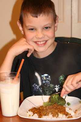
That's my nine-year-old in the picture, happily gobbling up a plate of dal, one of his all-time favorite dinners, and a menu staple in my house. Dal has a lot going for it. It's low in fat and calories, and extremely high in fiber, something most people get far too little of. I try to make at least one vegetarian meal per week for my family, so I like the fact that dal is meatless. The fact that it's meatless also means that it's extremely easy on the budget. And, it uses turmeric, a spice that's recently been found to help protect against various cancers. Besides all that, it tastes great, and the leftovers are good for lunch the next day, too.

Although I've tried others, I've been using this particular recipe for dal for at least 15 years, possibly longer. I found it in the back of a Good Housekeeping magazine at a time when ethnic foods were still pretty far off the radar for most people (including me). Something about its combination of spices sounded good, so I tried it (it was just me and my husband back then), and I've been making it ever since. I toned down the spices a bit when my kids were toddlers, but both of them have pretty much grown up on it. I make no claims as to the authenticity of the recipe, but a good friend of mine who spent several years in Fiji, a country with a large Indian population, also uses this recipe, and has said that it tastes more like the dal she remembers from Fiji than any other recipe she's tried. For me, it's enough that it's a healthy, meatless meal that I don't have to beg my kids to eat.

Oh, one more note. This recipe uses dried lentils -- the cheap, everyday brown kind that you find in a bag at the supermarket. If you want to go a little more gourmet, you can certainly try red lentils, or fancy green ones, but plain 'ole brown lentils are actually my favorite, as they give the recipe an earthy, robust taste. And, I like that fact that brown lentils become tender but still hold their shape -- smaller lentils or ones that have been cut will often fall completely apart as they cook, giving the dal a very different texture and consistency. If you want a creamier dal with a milder flavor, try yellow split peas instead of the lentils. Whatever legume you use, you really can't go wrong. Also, since fresh ginger wasn't readily available when this recipe was published, it calls for ground ginger. Feel free to substitute a couple of teaspoons of minced fresh ginger for the ground, if you have it on hand.

Finally, don't be put off by the rather long list of ingredients. Most of them are spices. Oh, and if you haven't used turmeric much, be careful with it. Turmeric is what gives curry that orange-yellow color, and it will stain things like rubber spatulas and plastic ware.

Dal (Indian Lentil Stew)

3 Tbsp. cooking oil
1 cup chopped onion
1-1/2 tsp. minced garlic
1 tsp. salt
3/4 tsp. ground coriander seed
3/4 tsp. ground ginger
3/4 tsp. ground cumin seed
1 tsp. ground turmeric
1/4 tsp. coarsely ground black pepper
1/4 tsp. red pepper flakes
1 bay leaf
1 cup dried brown lentils, rinsed
3 cups water

In a large saucepan or skillet, heat oil over moderate heat. Add onion, garlic, and all spices, including the bay leaf. Saute 5 to 10 minutes, stirring frequently, til onion is translucent. [It's really important to add the spices to the hot oil, rather than later, because heating the spices in oil is what releases their flavor.] Add lentils and continue to saute another 5 minutes, stirring often. Add water and bring to a boil. Cover pot; reduce heat to low and simmer for about 50 minutes, til lentils are tender and sauce has thickened. Discard bay leaf. Serve over hot cooked rice.

Makes 4 generous servings.


Sunday, September 13, 2009

Leading Lines


Sometimes rules about composing photographic images just seem like way too much effort. The problem is, even if you understand the rule thoroughly (and some of them can be hard to understand), it's just not a natural impulse to think about following obscure rules right before you press the shutter. I mean, there you are, snapping photographs of your kids playing at the park on a bright spring afternoon. What's running through your mind is probably not missing that great shot of Billy on the swings, or how little Amanda's hair is blowing in the breeze so adorably while she's playing in the sandbox. What you probably AREN'T thinking is, how can I make this shot more compositionally pleasing?

Well, sometimes it's worth it to think that way. There are any number of elements with respect to your photographs that are squarely within your control. While you can't change things like the weather or the time of day, you can move closer to or farther away from your subject, you can change the vantage point from which you're shooting, you can turn the camera horizontally or vertically, and so forth. If doing some of these things at least some of the time can produce photographs that you find more pleasing, that you're happier to share with people, or maybe that make you want to grab your scrapbooking supplies, then there is really no downside to trying them. The trick, though, is to learn and practice some of the so-called "rules" of good composition, so that they become second-nature. It's when they become second-nature that you'll find yourself using them to compose those everyday shots of your kids playing at the park. And when that happens, you'll also notice (not coincidentally) that you're getting a greater number of really good, and really compelling, images. Also, the more you know about compositional rules, the more you'll understand that, like all rules, sometimes it's better to break them.

Over time, I'll make an effort to discuss several different rules of image composition in my blog posts. But, since the overall goal is to make thinking about and applying the rules second-nature, I think it's important that they be introduced and discussed individually. That way, you'll have sufficient time to practice using one rule before trying another one. Oh, and by the way, these rules are by no means exclusive to photography; they're actually basic principles of design. As you learn them, start looking out for real-world examples of their application. After awhile, you'll notice these principles being used in print advertisements, in movie scenes, and many other places.

I thought I'd start with the rule or principle that I consider one of the easiest to learn and apply -- the use of a "leading line." What is a leading line? Well, when you take a photograph, you want your viewer to focus on your subject and, more generally, you want to "draw the viewer in" to the scene that you've photographed, whether that's a landscape or Amanda in the sandbox. A "leading line" is simply some line-shaped element in your frame of vision, whether real or man-made, that you purposely position along the bottom edge of your image in such a way that it acts as a kind of "line," effectively drawing the viewer's eye into the photograph. The "line" can be straight, curved, or squiggly -- it doesn't matter. It will still have the effect of drawing the viewer's eye into the image.

In terms of natural leading lines, a river is the easiest example to visualize. A road is probably the quintessential man-made leading line -- after all, a road is perfectly line-shaped and it was built to lead somewhere! But the truth is that all kinds of things can act as leading lines. It all has to do with where you position yourself so that you can take advantage of the linear properties of the element that you've chosen.

In the photograph above of my son Brian playing at the park, the tires embedded in the ground are the leading line. Brian was having a blast jumping from tire to tire; using the line of tires to draw attention to his activity gives the photograph a dynamic component that would be missing in a simple photograph of him standing on one of the tires. It's almost like you're jumping along the trail of tires right behind him. Here's another example. This photograph was taken at Lake Yellowstone in Yellowstone National Park:


In this photo, I used a fallen tree along the shore of the lake as my leading line. I noticed the tree near me as I was standing there taking photographs of the lake, and I simply positioned myself a bit behind it so that the tree was "pointing" toward the horizon in the resulting image. I found the almost eerie-looking shapes of some of the fallen trees at Yellowstone to be fascinating, so this shot allowed me to showcase both the shape of the tree and the serene beauty of the enormous lake. Landscape photographs are perfect for using leading lines, although as illustrated by the photo of Brian on the tires, the use of this technique certainly isn't limited to landscapes. But, generally, in a photograph you've composed using a leading line, you'll probably want everything in the frame to be in focus. This is as opposed to, say, a close-up, detailed image of a flower, where the flower likely looks better with a slightly blurred background. This means that you want great depth of field in your leading line photograph -- you want everything that the viewer sees, or almost everything, to be in acceptable focus. The easiest way to accomplish this is to use the "landscape" setting on your camera. Usually it's an icon of a mountain with a cloud over it. Using this setting will narrow the lens opening (aperture) of your camera, which will cause things both far and near to be in focus.

Remember how I said that a road is pretty much the quintessential leading line? Well, as the leaves start to turn beautiful fall colors (in my area of the country, at least) here is a great exercise for you to try. Drive along a country road (or any non-busy road lined with trees) and find a stand of trees sporting the beautiful yellows, reds and rusty browns of autumn. If fallen leaves litter the road, as well, so much the better. Set your camera on the landscape setting as described above, then experiment with using the road as a leading line into your photograph depicting the colorful trees. You can stand along the edge of the road, or right in the middle of it (if you're sure traffic won't be a factor). Take several different shots from several different perspectives, each time positioning the road along the bottom edge of your framed image. You'll see pretty quickly that it's an easy technique, and one that naturally lends itself to landscape photographs. If you're ready to branch out, think of a few other non-people photos that you'd like to take. Try to compose those images by looking for leading lines that can be incorporated into your photograph. Remember, a leading line can be almost anything -- a river, a tree branch, a sidewalk, the edge of a path, a row of flowers, etc. Have fun, and pretty soon, you'll be seeing potential leading lines everywhere!


Monday, September 7, 2009

Banana Bundt Cake with Caramel Glaze


I admit it. I am a banana snob. I love bananas, but I won't eat just any old banana. Nope. It has to be perfectly yellow and perfectly ripe, sweet but still firm, and without any of those icky brown speckles on the skin. I know that bananas with those speckles are just fine to eat (my father-in-law has told me this a million times), but I just like bananas better before they get to that point. Even worse, I've transferred my banana snobbery to my older son, as well. As a result, we often have bananas sitting around the house that are unsuitable for eating out of hand. But, being rather frugal in matters of food and cooking, I hate to toss overripe bananas. Until recently, though, I only had one go-to recipe that used overripe bananas and, while I like that banana muffin recipe, there have been times that I wanted to make something besides muffins.

Well, I recently found the recipe below for Banana Bundt Cake that uses overripe bananas, and in addition to being super easy (it starts with a boxed cake mix), it really tastes great.

Banana Bundt Cake with Caramel Glaze

1 package butter-recipe cake mix
3/4 cup sour cream
2-3 large, very ripe bananas
1 tsp. baking soda
1/2 cup butter, softened
1 tsp. vanilla
3 eggs
1 cup chopped walnuts

Preheat oven to 350 degrees. Grease and flour a bundt pan. Mash bananas with a fork and set aside. In a large bowl, combine the cake mix and baking soda. Add the mashed bananas, sour cream, softened butter, eggs and vanilla. Using a hand mixer, beat at low speed until combined (about 30) seconds, then beat at medium speed for four minutes. (Yes, the amount of time really does make a difference. I just set my kitchen timer for four minutes to be sure I don't shortchange my batter.) Fold in the walnuts, reserving a couple of tablespoons for the garnish. Pour batter into prepared pan. Bake in the preheated oven for about 50 minutes, or until center of cake tests done. Allow to cool on a wire rack. Remove cake from pan, invert onto serving platter, and drizzle with caramel glaze (recipe follows). Before glaze has fully set, sprinkle reserved chopped walnuts over the top of the cake.

Caramel Glaze
: Ok, there is no "recipe" for this glaze, but there is a little technique. It's a GREAT tip that my friend Pat shared with me, and I'm so grateful that she did. Here's all there is to it. Start with a can of caramel frosting, the kind you buy in the grocery store in the baking aisle. Scoop about one-third of the frosting into a microwave-safe bowl. Microwave on medium power for about 20-30 seconds. Take the bowl out of the microwave and stir. You want the frosting to be a thick liquid (like a glaze). Don't overheat! Start with 20-30 seconds. If it needs ot be a little thinner, just microwave it for another 10 seconds and check it again. Once your frosting has reached the desired consistency, simply drizzle it onto the baked, cooled cake, allowing some of the glaze to drip down the sides. Ideally, the glaze will be just thick enough that the drips won't reach the serving platter, but will fall beautifully to mid-cake and stop there. Keep in mind that the more glaze you spoon on any one area, the bigger and heavier the drip will be. So start small and experiment as you go along the cake. This glaze "recipe" will work with any flavor or brand of frosting, but just remember that whatever amount you microwave will be forever changed, so you don't want to use the whole can of frosting if you don't need a huge amount of glaze. Using one-third of the can should give you plenty of glaze for the bundt cake.

By the way, this is a great cake to make for a work function, because it's the kind of thing that LOOKS like it took a long time and lots of effort to make. The fact that it was really super-simple to make can be your little secret!

Friday, September 4, 2009

Cute, Quick Baby Album


I love making scrapbooks as gifts when someone I know has a new baby, but a full-blown scrapbook can be incredibly time-consuming. Often, I need to come up with a gift in a short time frame, like over a weekend. So, I've developed a method of making small baby albums like the one pictured, which are cute, but are also so simple that they can easily be put together over a weekend.

I use the printed 6x6 American Crafts albums. These come in lots of different prints, including seasonal ones, and they have 10 page protectors already bound into the album. The binding is permanent, so you can't add additional pages to these, but frankly, the fact that you're limited to 10 page protectors is one of the reasons these albums are so quick to put together. I got a mixed set of twelve or so of the American Crafts albums from QVC for around $20, but you can also buy them individually. Of course, any 6x6 album would also work. I like to decorate the cover of the album with a painted wooden embellishment in an appropriate shape. For the album above, I picked a moon and stars. I added some stick-on rhinestones to the stars to bling them up a little bit, and I used rub-ons to add Preston's name to the cover. You can buy the wooden embellishments already painted at places like Michael's and Hobby Lobby for around 50 cents each, and they have tons of cute shapes.

To keep the album simple, I choose just a few different colors to work with, and some simple embellishments. For the baby album pictured, I found a set of K & Co. baby embellishments at WalMart for around $4.00. The set included flat, glittered stickers (ABC theme), word stickers, and some really cute 3-D embellishments. The set was more than enough to complete the whole album. Although I sometimes used patterned papers for these kinds of albums, I chose cardstock this time, limiting myself to just a few solid pastel colors that went well with the embellishments I'd picked -- green, lilac, yellow, and a couple of shades of blue. One reason I like to use the 6x6 albums is that I can get four 6x6 pages from one 12x12 sheet of cardstock, which is very economical. I generally make all of the layouts for the album using the same template, just varying the colors and embellishments used. I like to put a baby-related quote on the lefthand side of each layout (do a Google search for "baby quotes"), and the righthand page is left mostly blank for the recipient to add a 4x6 photo. That's another reason I love the 6x6 album size -- a 4x6 photo fits perfectly on the page with no cropping. It's very user-friendly even if the album recipient has never scrapbooked. You can see a couple of representative layouts in the photo above, but below is a close-up of one layout from the album. (You can enlarge the image by clicking on it, if you really want to see the details.)


I started with two 6x6 squares of cardstock in the same color, then I added the fat pieces along each side by simply tearing a contrasting piece of cardstock into strips about 2" wide. Sometimes I ink or chalk the edges of the border pieces, but for this album, I didn't. I used a stamp to make the narrow word border along each edge; the stamp I used varied with each layout. I adhered my quote (printed out on my computer in a cute font) to the lefthand page, then added a few of the ABC and word stickers in a pleasing arrangment. On the righthand page, I added a journaling block using a stamp from one of the Autumn Leaves collections, then I added a couple more word stickers. The only requirement with respect to the journaling stamp was that it had to be less than about 1-1/2" high, so there would still be enough room for a photo. For other albums, I've attached small, plain tags to the page for journaling, or you could use a plain or lined rectangle of cardstock, as well.

For the inside cover page of the album, I used large die cut letters to spell out the baby's name. I stamped a border, added a couple of cute, 3-D embellishments, and it was done. I like to include a little note to the new mom explaining that the album is designed to hold one 4x6 photo on each layout. If you wanted to, you could also add a journaling pen and some acid-free adhesive squares for a complete gift.

I'm sure it's obvious from the photos and from my description that there are a million different ways you could make an album like this. If I have more time, or the album is for a close friend, I may spend more time on the layouts, making them more elaborate and adding more embellishments. If you have pictures of the new baby, you could go ahead and adhere them to the pages, so that the album is ready to be enjoyed the minute the gift is opened. And, if you choose an expandable album rather than one of the American Crafts ones, you can add pages and make a much bigger album, say, for photos of baby's first year. The point is, a personalized, handmade gift doesn't always have to be expensive or hugely time-consuming. It can be fun and very rewarding to keep things simple and throw together a cute gift album in just a few hours.